Beyond Techspectations, Beyond Tokenism: Why Currys’ “Sigh of Relief” Is a Benchmark for Accessible Content
A review of Curry's recent ad campaign Beyond Techspectations | Sigh of Relief x Accessible Dial
Most brands still treat accessibility in marketing like a post-production afterthought: add captions at the end, maybe create a separate audio-described version if there’s budget, and hope nobody notices that the “accessible” experience is fundamentally second-class.
Currys’ “Sigh of Relief” (part of the Beyond Techspectations platform) does something far rarer: it puts layered access inside the creative itself, in a way that’s visible, intentional, and genuinely integrated. The result is an ad that’s not only more inclusive—it’s simply better content.
It’s no surprise that “Sigh of Relief” won Channel 4’s Diversity in Advertising Award and was backed by significant Channel 4 media inventory.
What the ad is doing (beyond the joke)
At the narrative level, the concept is simple: customers with access needs are supported by knowledgeable Currys colleagues, and the “sigh of relief” is exaggerated into the brand’s familiar hyperbolic comedy world.
But the real innovation is how the ad handles communication.
Instead of producing different variants for different audiences, Currys and AMV BBDO built a single piece of work that removes common viewing barriers up front—so more people can experience the same story at the same time.
The key point: two visible access roles, plus subtitles, creates “layered access”
What makes this campaign stand out is the deliberate decision to make accessibility part of the frame, not an optional extra.
Across the campaign, the ad includes:
An on-screen audio narrator / audio describer
A British Sign Language (BSL) interpreter
Subtitles visible at the same time
That combination matters because it acknowledges a truth brands often avoid: access isn’t one-size-fits-all.
Captions help many people, but not all. BSL is a first language for many Deaf people, and written English may not be equivalent. Audio description supports blind and low-vision audiences, but it’s frequently treated as a separate “special” version, meaning blind viewers get a different (often delayed or unavailable) experience. This campaign rejects that hierarchy and makes the accessible experience the default, not the exception.
Why “layered access” is a content quality upgrade, not just an inclusion win
A useful way to think about this is: accessibility features often improve clarity. Clarity improves retention. Retention improves performance.
Layering access helps:
People watching on mute (common on social)
People in noisy environments
People who process information differently (including many neurodivergent viewers)
People with hearing loss or sight loss
People who benefit from redundancy (seeing + reading + hearing reinforces meaning)
So yes, it’s inclusive. But it’s also a practical creative decision: remove friction, increase comprehension, keep more people with you.
“Accessible Dial” is a strong example of accessibility as a product story, not an abstract message
A lot of “inclusive” ads talk about inclusion without showing what it looks like in real life.
One of the strengths of the “Sigh of Relief” executions, including the “Accessible Dial” cut, is that accessibility is presented as something tangible: a colleague identifies a feature that reduces barriers, such as an appliance with a large, clickable dial designed to make interaction easier.
That’s important because it positions accessibility where it belongs: in the design of everyday products and services, and in the competence of the people helping you use them—not as inspiration, pity, or a one-off “diversity moment.”
Built in from day one (and that’s the real lesson for brands)
Currys and AMV BBDO have been clear that accessibility wasn’t tacked on at the end. The campaign was developed with input from partners including Open Inclusion, RNIB, and RNID, and the work was built to be “inclusive by design.”
That approach changes everything, because once access is in the brief, it shapes:
the script (what needs describing, what needs signing, what must be readable)
the blocking and framing (where people stand, what can’t be obscured)
the edit rhythm (time to read, time to sign, time to process)
the production plan (consultancy, review, iteration)
In other words: access becomes a creative constraint that improves craft, rather than a compliance task that arrives too late to do properly.
Why most brands don’t do this (and why that needs to change)
Many brands avoid on-screen BSL or integrated audio description for predictable reasons:
fear it will “distract” from the story
uncertainty about how to frame it well
production teams not resourced or trained for it
assumptions about audience size and ROI
But this campaign is a public case study showing the opposite: when done intentionally, these elements can enhance the storytelling—and even become part of the humour and character dynamic, rather than an interruption.
A practical checklist: how to build accessible video content that doesn’t feel bolted on
If you’re a brand, agency, or content lead, here’s the replicable playbook:
1) Put accessibility in the brief (non-negotiable)
Define what “accessible” means for this asset (captions, audio description, sign language, readable supers, etc.)
Decide early whether you’re aiming for “one asset for everyone” versus multiple versions
2) Budget time for access, not just money
This campaign highlights that the industry isn’t always set up for accessibility-first production—so you have to plan for it.
3) Co-create with relevant communities
Work with lived-experience consultants and organisations, and test with audiences who will actually use the access features.
4) Design the frame
Keep interpreter placement consistent and unobstructed
Ensure subtitles are readable (size, contrast, safe areas)
Avoid rapid cuts that reduce comprehension time
5) Don’t treat accessibility as “serious mode”
One of the campaign’s biggest wins is proving an accessibility message can live inside humour and mainstream brand tone. Marketing Beat+1
The takeaway: accessible content is better content
“Sigh of Relief” doesn’t just represent disabled people, it changes the default production mindset by showing what it looks like when access is embedded, on-screen, and treated as creatively valuable.
More brands should copy this approach, not because it’s trendy or award-friendly, but because it respects viewers’ time and attention. Accessibility reduces friction. Reduced friction improves communication. And better communication is the whole point of advertising.
If your brand is still treating accessibility as a last-minute checklist, this campaign is your reminder: the best time to add access is not in the final export. It’s in the first creative conversation.
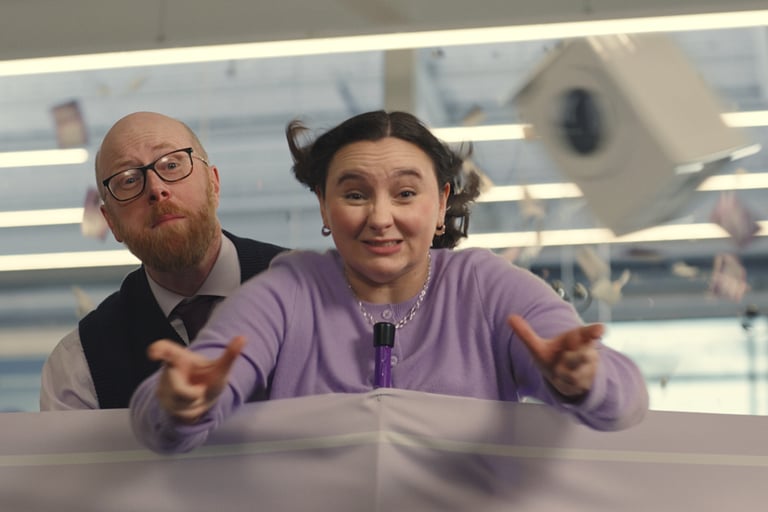
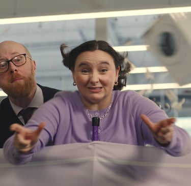
Image Credit Currys – “Beyond Techspectations | Sigh of Relief x Accessible Dial” campaign still.